The Rescue Federation
Medical Ambulance & Emergency Rescue Services
Year
2026
Client
The Rescue Federation
Service
Brand Identity
The Rescue Federation is a professional emergency medical transport and rescue company providing reliable ambulance services by road, air, and rail. The identity is designed around trust, speed, safety, and coordinated emergency response, creating a strong and recognizable presence across ambulances, aircraft, trains, uniforms, digital platforms, and emergency communications. The visual system communicates a clear commitment to saving lives and delivering dependable care when every second matters.


Designed a complete brand identity for The Rescue Federation that communicates trust, urgency, safety, and coordinated emergency response. The solution brings the brand to life through a strong medical visual language, clear typography, and a distinctive system built for road, air, and train ambulance services.
The identity is designed to work consistently across ambulances, aircraft, trains, uniforms, medical equipment, digital platforms, and emergency communications, creating a recognizable presence wherever the organization operates.

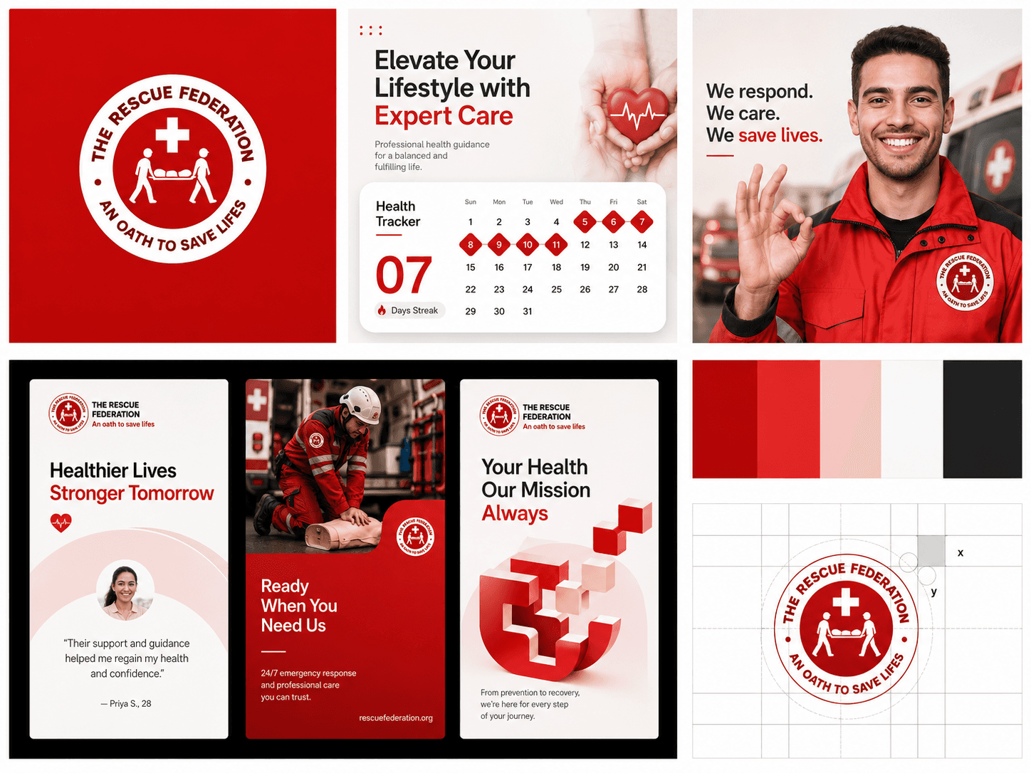
The Rescue Federation logo is built around a strong rescue symbol and medical cross, representing emergency care, protection, and rapid response. Its bold, clean construction creates a distinctive mark that remains recognizable across road ambulances, air ambulances, trains, uniforms, medical equipment, and digital applications.
The visual identity uses red as the primary brand color, supported by black and white to create a balance of urgency, trust, and clarity. The result is a versatile identity designed to communicate strength, reliability, and a commitment to saving lives.


The Rescue Federation graphic system uses bold rescue-inspired forms, directional lines, and modular shapes derived from the logo to create a strong and recognizable visual language. These elements represent movement, emergency response, coordination, and protection while remaining clean and easy to apply.
The system is built around Rescue Red #AB0000, supported by black and white, creating a bold and dependable presence across ambulances, aircraft, trains, uniforms, digital platforms, signage, and print materials.


The Rescue Federation brand guidelines define a clear system for using the logo, color palette, typography, graphic elements, and imagery. These rules ensure every brand touchpoint feels consistent and intentional, from emergency vehicles and medical equipment to digital platforms, uniforms, and communication materials.
The guidelines are built around Rescue Red #AB0000, supported by black and white, creating a bold, professional, and recognizable identity that reflects trust, urgency, safety, and reliable emergency response.


Brand Strategy
Visual Identity
UX Research
UI/UX Design
Design System
Website Design
Framer Development
Responsive Optimization
Motion & Interaction Design


The Rescue Federation visual identity takes a bold, medical, and purpose-driven approach built around strong geometry, structured layouts, and clear visual hierarchy. Rescue Red #AB0000, black, and white create a confident and highly recognizable foundation, while the logo and graphic elements reinforce the themes of emergency response, protection, and movement.
The system is designed to feel professional, responsive, and consistent across road ambulances, air ambulances, trains, uniforms, medical equipment, digital platforms, and brand communications.

The final Rescue Federation identity creates a strong, professional emergency medical brand built for speed, trust, and reliability. The cohesive red, black, and white system strengthens recognition across every touchpoint, while the bold logo and structured visual language give the organization a distinctive presence.
The identity provides a flexible foundation for road, air, and train ambulance services, extending seamlessly across vehicles, aircraft, uniforms, medical equipment, digital platforms, signage, and communication materials.

Professional emergency medical brand identity
Strong rescue-focused logo system
Distinctive Rescue Red #AB0000
Bold red, black, and white color palette
Visual language inspired by emergency response and movement
Flexible identity for road, air, and train ambulances
Clear and highly legible typography
Structured layouts with strong visual hierarchy
Consistent branding across vehicles, aircraft, trains, uniforms, and digital platforms
Designed for medical equipment, signage, and communications
Built for scalability, recognition, and rapid identification
Identity centered around trust, safety, speed, and saving lives